Coldtyre wrote:
EAS wrote:
Soul Reaver wrote:
Cool graph
Is it about porpoising?
Is there an article that provides:
- Source
- What the graph describes (I assume vertical G's from porpoising? But this needs to be explicit. And at what speed?)
- What is the full rectangle and why is there a split its middle?
- What are the white bars? Error bars normally, but is that amplitude of confirmed measurements, or uncertainty in data?
- Whether it's better to have a high amplitude, or a high average, or both? We see the two best teams (F and RB) with opposed results.
I'm being an ass, but that's what I would "kindly ask" whoever provided this graph to clarify and come the fuck back with something that doesn't need me to assume shit and break my brain trying to make some sense of it
Yes, I'm currently at work assuming shit and breaking my brain trying to make some sense of obscure data that COULD HAVE BEEN CLEAR FROM THE START GODDAMMIT
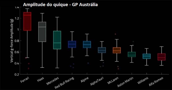
Can't talk about the source. But I can help on how to read this graph, it's tricky indeed if you don't go deep into data visualization.
I'm assuming the Vertical G Force stated here is the G-Force for every bounce resulted of the porpoising. So, each column represents all bounces of both cars from a specific team.
- The horizontal line inside the colored box is the median value of each set.
- The colored box represent 50% of all these bounces for a team
- The white bars, also known as whiskers represent the remaining 50% of all the bounces
- In some cases you'll have also small dots above or below the whiskers which represent events that are considered outliers.
So, some takeways we could have here are, for example:
- Ferrari has a "stronger" porpoising while Alfa and Williams have a weaker one.
- Not only Ferrari and Haas have the strongest effect, they have the most unpredictable ones, while teams like Williams, Aston Martin and Alpha Tauri are more predictable in this sense.